
Gym CC
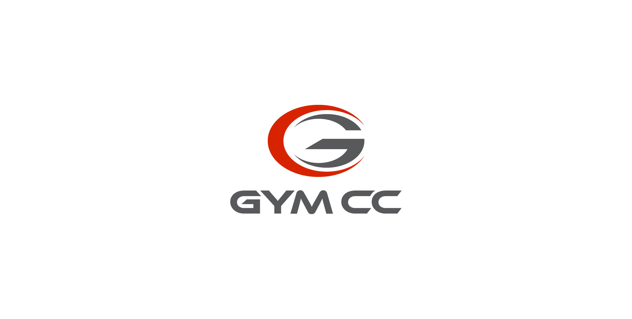
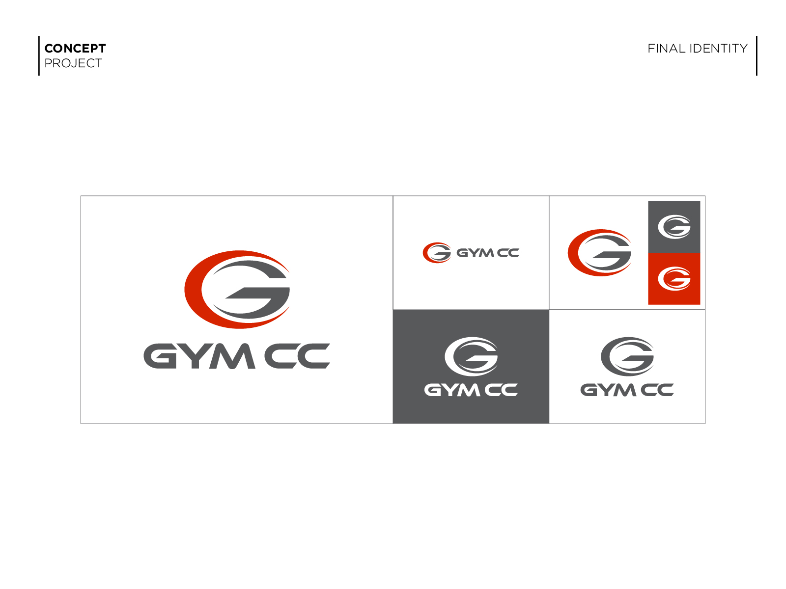
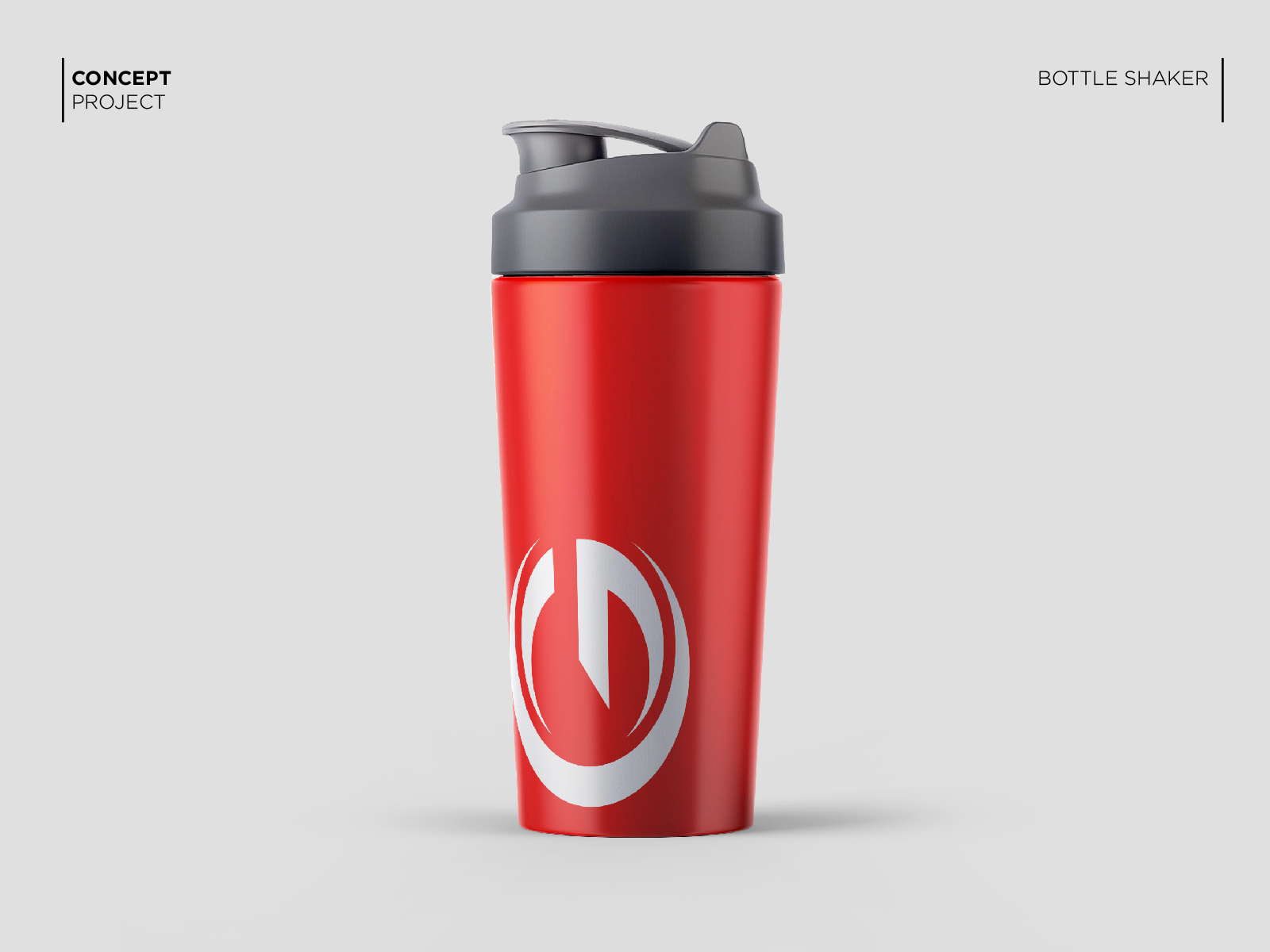
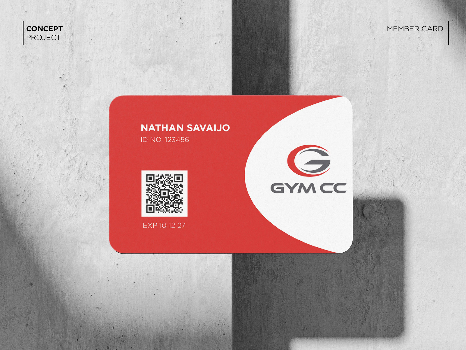
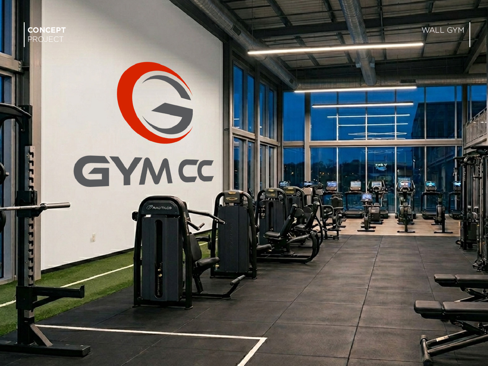
Gym CC is a concept identity created for a multi-purpose indoor sports and fitness facility. The goal was to develop a strong and recognizable logo that communicates energy, movement, and performance while maintaining a simple and memorable appearance.
CHALLENGE
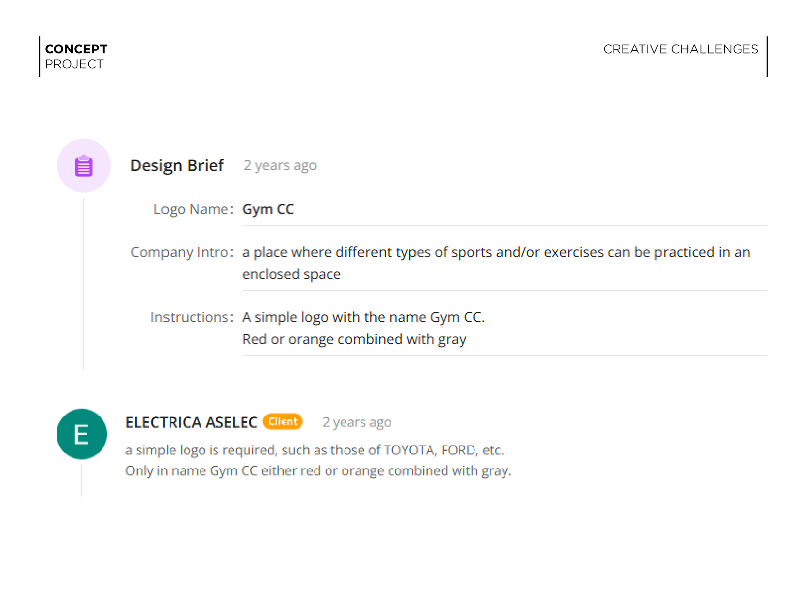
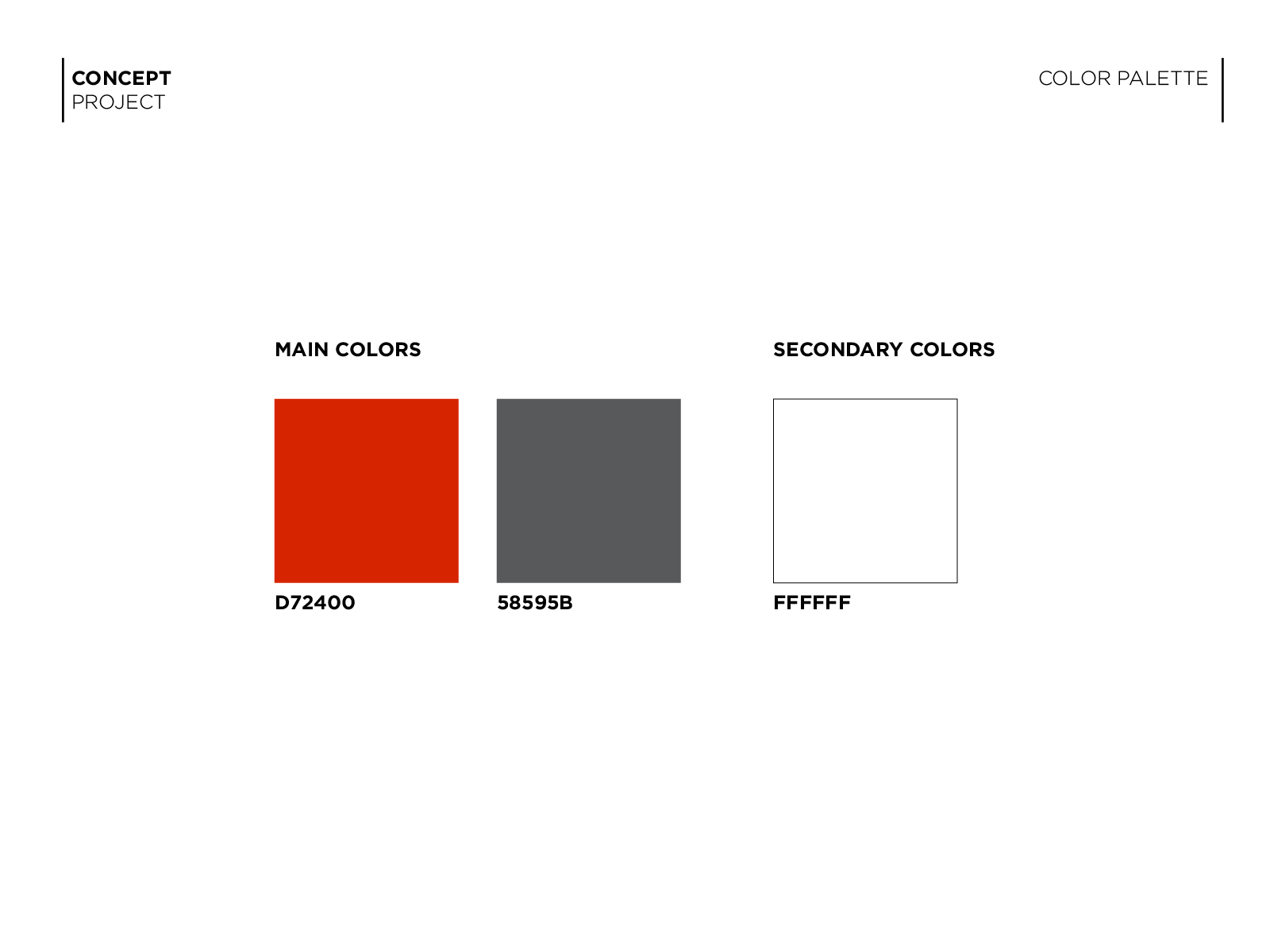
The brief requested a simple logo using the name Gym CC with a red or orange and grey colour combination. The identity needed to feel modern, athletic, and suitable for a facility that accommodates different types of sports and exercise activities.
OBJECTIVES
* Create a bold and memorable logo.
* Communicate strength, energy, and movement.
* Maintain a clean and recognizable structure.
* Reflect an active fitness environment.
* Follow the requested red/orange and grey colour palette.
STRATEGY
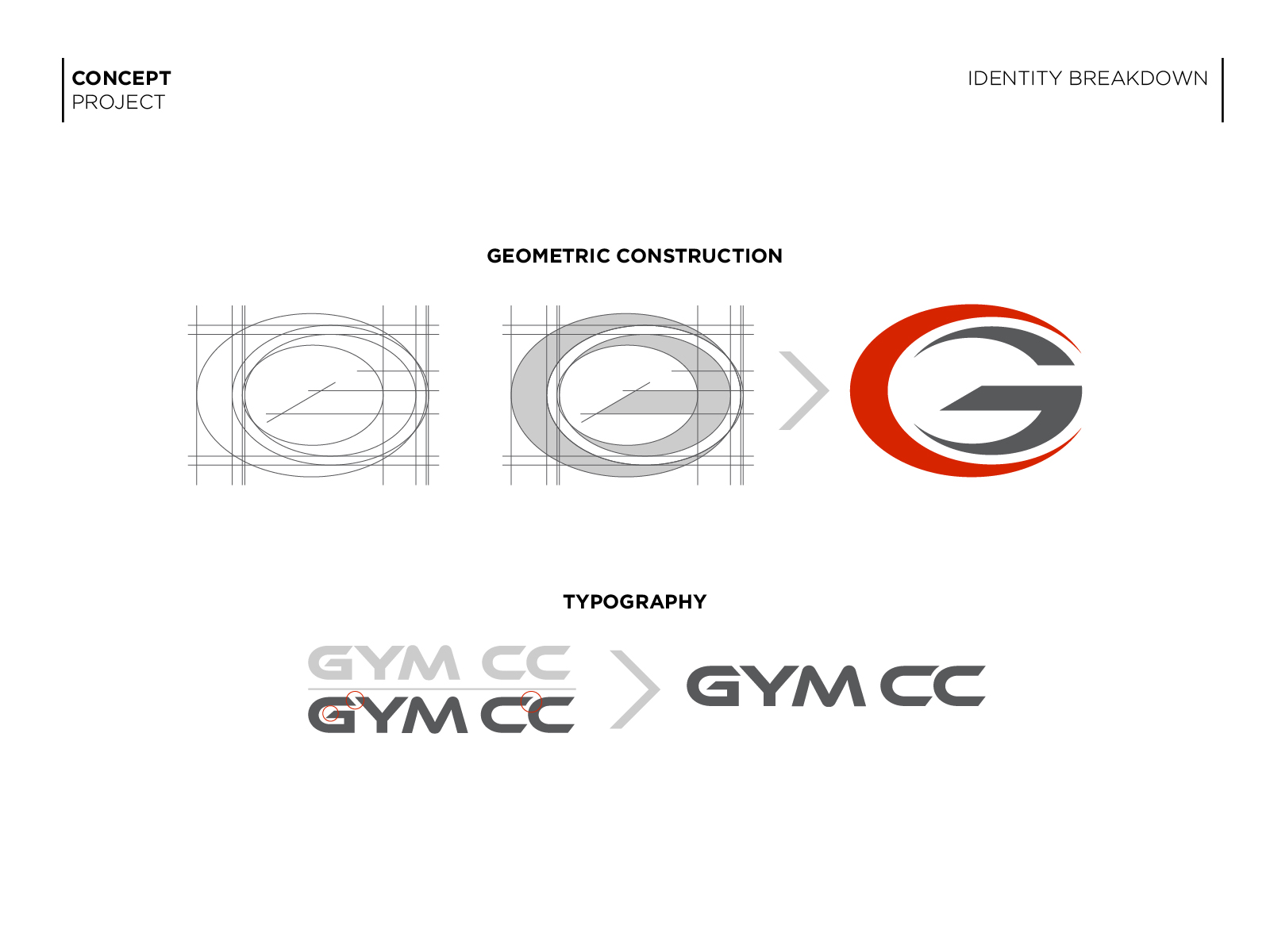
The visual direction was inspired by performance-oriented brands commonly seen in automotive and sports industries. Rather than relying on generic fitness symbols such as dumbbells or human figures, the concept focuses on a custom letterform solution.
The primary symbol is built around the letter G, creating an emblem that serves as both a brand mark and a recognizable identifier. The circular motion suggests movement, momentum, and continuous progress, while the bold structure reinforces strength and endurance.
KEYWORDS: Active, Energetic, Strong, Modern, Performance

You should also read:

Guardian Property Advisors
Guardian Property Advisors provides insurance claims consulting services for owners of commercial properties. The company represents clients throughout the claims process, helping maximize settlements while reducing operational disruption caused by property damage. Observed Fact: Based on the original project brief. CHALLENGE The identity needed to…
Continue reading...